You have definitely heard about it before, but perhaps you had not imagined everything you can learn about perception, communication and visual culture from its study. On the streets, in the subway, in shops, and probably also at your home, every day you come across it many times, and yet, its presence will always go unnoticed.
Throughout its 25 years of life Helvetica has become one of the most ubiquitous, loved and at the same time criticized typefaces of modern typography. Stay and read this article to take a look at its history, understand what is it that makes it so special and find out how it can be helpful for you in your work as a cover designer.
Its background
The Helvetica typeface was born after World War II by the hand of the popular Swiss design school, and in opposition to the already outdated trends that dominated visual communication.
Its impact was considerable in the world of advertising. To give you an idea of the dimensions of the change that took place, before the 50s many print ads looked like this:

There was a clear misuse of handwritten and barely legible typefaces, which was added to a poor hierarchy of the elements, causing a loss of focus and message strength.
In this context, designers were eager to find a typeface that would help them give greater impact and clarity to the messages they wanted to convey. Helvetica came at the right time. Its use quickly became popular and during the decades of the sixties and seventies it got to be the favourite of many brands, which used it in their advertising and in their logos (in fact, many well-known brands still use those original logos today).
Thus, the new images of modernity were characterized by clearer and stronger messages. Helvetica played an important role in this modernization:
 Neutrality and logic
One of the distinguishing features of this typeface is its apparent neutrality, that is to say, the font goes unnoticed to give importance only to the content.
We can see an illustrative example comparing American Apparel and American Airlines logos, both with Helvetica:
Despite the similarity of the logos, American Airlines and American Apparel are two companies with very different philosophies and audiences. However, aren’t they afraid that people mistake them and their images are harmed by unwanted associations?
That’s where Helvetica’s magic takes action. The design of the typeface itself does not provide any information and the message lies rather in the context, the intention of the sender and the interpretation of the receiver, so two very similar designs can actually acquire very different meanings depending on the connotations that are assigned to them.
In short, its apparent simplicity and invisibility allows it to adapt well to almost any use, and besides, its design conveys an image of “modernity“, so we are supposed to get good results easily and intuitively even without an extensive knowledge of design.
Helvetica today
Throughout the decades, Helvetica has gathered many followers, but also many detractors. Some designers argue that it’s not a simple and invisible typeface in an innocent sense, but that it’s actually cool and uniform, which could even be linked to certain political implications.
In fact, many companies chose this font in the past to associate with that alleged innocence, and that way achieve greater acceptance by the public.
Moreover, it has also been criticized that these characteristics that make it so easy to use, along with its ease of access (Apple includes it in its operating system, and Windows made his own version with Arial) have trivialized its use, turning it into the “default typeface”.
In any case, this criticism is within the scope of professional designers. As far as the rest of us are concerned, things wouldn’t be the same if this typeface did not exist. Helvetica is always around us and it guides us in everything we do (it’s in signs, public transport, clothing, packagings, documents and so on).
Anatomy
As I noted earlier, the Arial typeface we all know is a version of Helvetica that Windows adopted and popularized, and that is especially designed to be read on digital displays. Some say it’s nothing more than a cheap copy, but the point is that its use is equally if not more widespread than that of the original.
One trick to differentiate Helvetica from Arial or just to identify the Helvetica typeface in general is to look at whether the ends of the strokes are cut horizontally or obliquely. Here you can see the difference (Helvetica is blue):
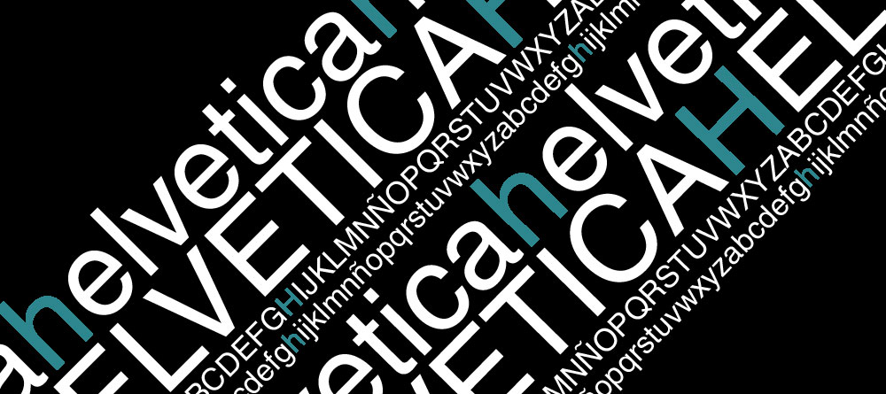
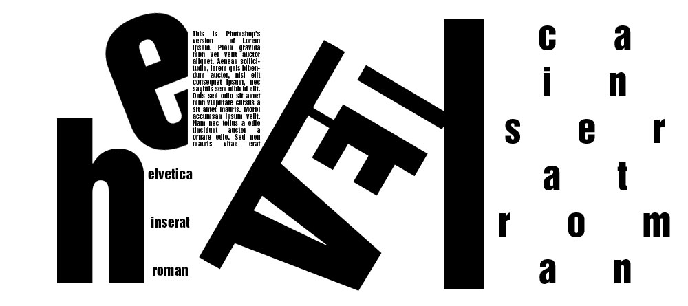
Besides the classical type, there are countless of variations of this typeface. You can see many of them at the Linotype’s website, but I will show you a few of the most common families in this little experiments I did:
- Here’s the plain and simple Helvetica (before a more commercial name was assign to it, it was called Neue Haas Grotesk):
- This here is Helvetica Inserat Roman:
- And this one, Helvetica Light:
Helvetica into editorial design
Adding typefaces can be one of the most complicated parts of the whole process of designing a book cover. The decision of choosing a typeface should not be taken lightly, and using a particular typeface without considering the specific characteristics of the message to be communicated or the medium in which it will be transmitted is not a good practice.
However, if you’re not a professional designer, you can get good results using tools that can make your work easier depending on your abilities.
While professionals often criticize amateur’s misuse of Helvetica, this font is far from being stigmatized into editorial design and cover design, and the “big” publishers often use it:
You can see more examples in the Book Cover Archive. And if you are interested in learning more about Helvetica, I recommend you see this 2007 monographic documentary.
How do you choose the fonts for your covers? Do you have your own set of “safe” fonts, or you just try to find the most appropriate typeface for each use?





Leave a Reply