During my studies in Advertising I had the opportunity to learn a few concepts related to design, perception and visual composition. As it sometimes happens, as time went by I forgot many things I didn’t want to forget (and others that I did), but the simple act of paying attention and conceptualizing these processes would influence the way I would see and produce images forever.
One of the theories I remember the most are the Gestalt laws of the perceptual organization, a set of principles by which this German School proved that we perceive visual stimuli as part of a whole and according to their relations of similarity or difference with the surrounding elements. You probably heard the axiom which is usually used to summarize this thought:
![]()
In this post I take the opportunity to recall, and to teach them to you if you didn’t know them, the main rules of perceptual organization of this school, and I will do so with illustrated with cats, which as everyone knows, is the best way to learn things today.
1. Figure and ground
This law defends that the brain can’t interpret an object as a figure and as a background simultaneously.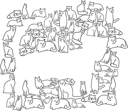
2. Similarity
We tend to associate similar stimuli grouping them as parts of the same figure (even if they are not identical).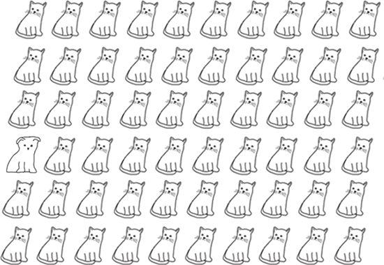
3. Proximity
Our brain groups elements based on the on the distance that separates them.
4. Good figure or Pragnanz
The brain sees the forms in the most regular, simple, symmetrical and ordered possible way, removing irregularities from consciousness.
5. Closure
The brain tends to complete unfinished images. 
6. Common Fate
Elements that move in the same direction and speed are perceived as one unit.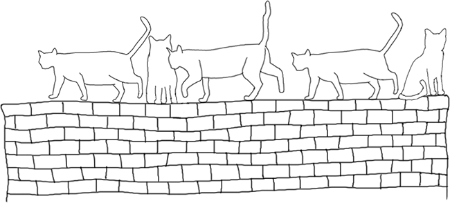
7. Continuity
Stimuli shaped in the same continuity are perceived as a unit. Even if various forms intersect or are hidden behind others, our brain will try to separate them.
So these were the basic laws of Gestalt. The world is full of ads, book covers and other formats that apply them more or less explicitly. If you analyze your own perceptual process focusing on some of these examples, you’ll end up embracing them and developing a more critical eye.
Knowing how the brain processes images will also allow you to organize your designs and graphic compositions in a more harmonic (or dissonant) way.
What do you think about these laws of perception? Do you know any others? Do you think you can apply them to your work?



Leave a Reply