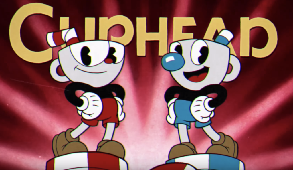
Before I tried Cuphead I was always very curious about the criticism the game always got for being extremely difficult. I couldn’t believe that the developers, who seemed to have spent quite some time and effort in building such a big thing, would just mess up with a basic principle of game design such as balancing.
I had also heard about the hypothesis that by making the game purposely difficult, the developers would manage stretching out the limited content of the game so that it felt like more to the player.
After playing Cuphead myself, though, and even considering that production limitations might have been part of it, I think that looking at the way difficulty is formulated as a design pillar, and how consistently that vision executed, Cuphead it a greatly designed game in its own terms.
For me Cuphead is, basically, a statement on difficulty.
Art style
It’s not a coincidence that Cuphead’s visual style borrows that much from Max Fleischer’s 1930s cartoons. Besides giving the game a distinctive mood and a playful sense of humor, there are some values from that traditional animation style that actually have an impact in the flavor of the gameplay.
For example, the extremely short and even non existent anticipation phases in the attack animations of final bosses, which are always considered a must have, as they give the player space to react in the flow of the combat.


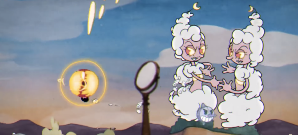
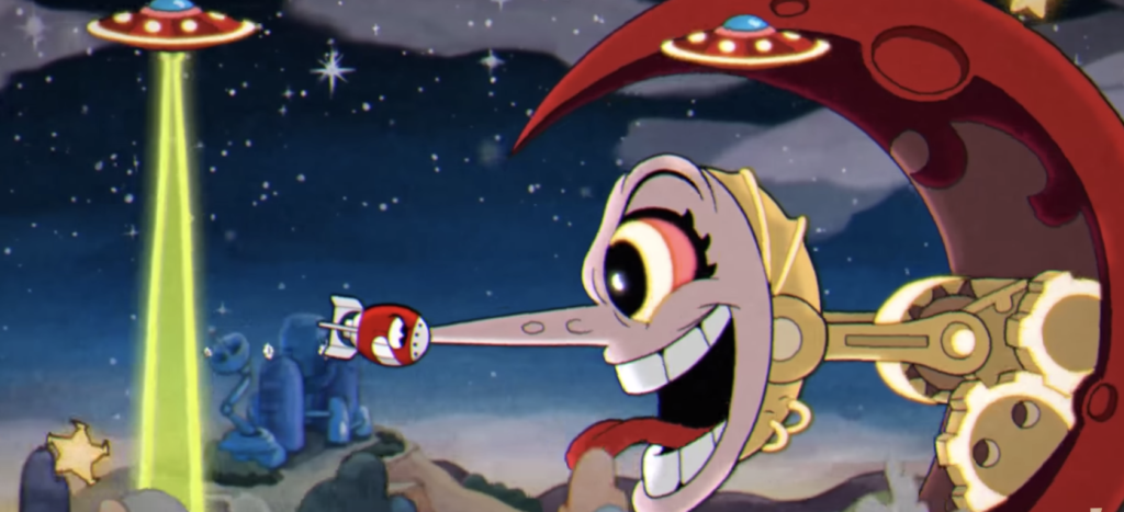
Another place where the animation style is defining an aspect of gameplay is sudden and extreme variation and transformation, which renders in that psychedelic quality that’s probably the most well known trait of this type of cartoons. In Cuphead, we can see how that’s reflected in the fights against the final bosses, which go throughout extreme and unpredictable transformations in each phase, all of which have different behaviour that are impossible to anticipate by the player.
It’s funny to see how, in most of games, final bosses that level up to the next phase usually let the player build up on what she knew from the previous stage, in a way that she just needs to find out where the twist for the new one is. In Cuphead, however, that knowledge the player needs to get with so much suffering, becomes obsolete and ready to dispose very quickly. Which is, by the way, one of the main frustrations and thrills of playing this game.
Progression
There are many more places in the game design of Cuphead where the developer basically skipped basic rules and common principles of the discipline. Starting with the learning curve, which is systematically and recklessly perverted, but also in a whole spectrum of levels of granularity (this would give us enough material for its own article), including the level progression in the world map.
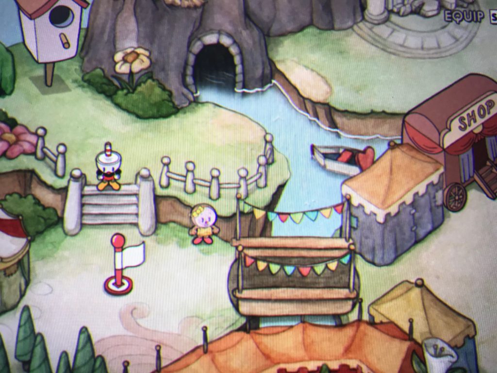
When I started playing Cuphead, I was confused for a while, as the first level I came across with was a final boss instead of a regular level. But that’s actually it. In Cuphead, the distribution of levels is a different story. Most of the levels are battles with final bosses, and there are just a few platform levels scattered here and there. Palate cleanser levels like the mausoleum, that are based on a different game mode, are also randomly injected in the non-linear progression.
Finally, shortcuts open here and there in the map making the progression even more loose and chaotic, which I need to say, fits pretty well with the flavor of the whole thematic approach.
Story
From the first second of the game, where the background story is told in a visual sequence, we know the characters are facing an impossible quest. Almost as impossible as what finishing the game is going to be for the player.
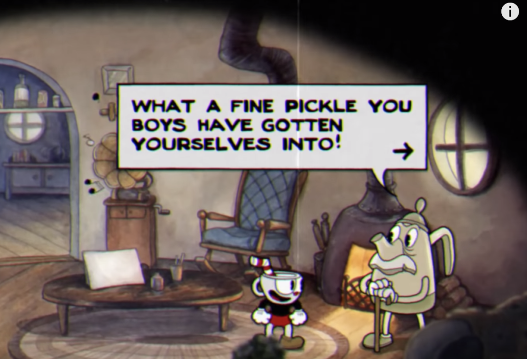
The beauty, though, is on the naiveness of the characters. Starting with their idle poses, their walking cycles, and their reactions to dialogues, Cuphead and Mugman seem to be always hopelessly optimistic about their quest. Hard to blame then when everything in the world they explore, like the sympathetic characters that cheer them up as they come across, or the pleasant environments, wouldn’t let them anticipate the hell that’s burning beneath the surface.
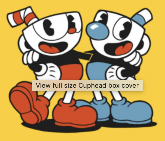
The player is mislead in a similar way with things like the jolly background music that plays when she’s exploring the map, or the colourful and responsive UI. All this always made me think that the game is making fun out of the characters and the player, but in a sort of friendly way.
In the end, either due to their ignorance or to their stubbornness, both the characters and the player choose to remain determined and stick to the journey, embracing the irony in it.
Sound design
The described tension is conveyed in subtle ways, like in the sound design. Each time the player dies and goes back to the map, we can hear a deep sigh, purposely coming from Cuphead. Just a simple sound effect that condenses the emotion the player is feeling in that very moment, when after trying and failing even once more she tells herself “and it’s probably going to happen again, and again, and again… But what else is there to do…”.
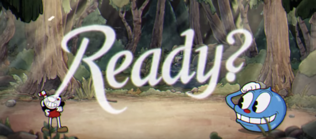
Other bit of sound design where the game/developer is prominently putting the finger in the wound is at the start of each game, where an anonymous announcer shouts motivational and passionate cheering up lines. The disconnection from reality here results in a delicious touch of irony. As both Cuphead and the player both know that this is most surely not going to be the successful try, this only makes them feel even more disappointed.
Other features that support the theme
There are other features and balancing considerations in Cuphead that I like seeing from a thematic point of view, as they build towards a consistency that makes the experience memorable beyond the anecdotal.
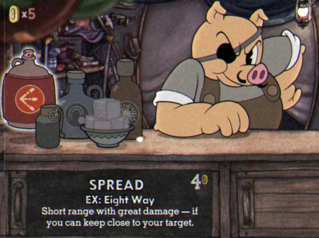
For example, the upgrades from the shop, as one would expect, are very expensive. From one side, even trying to get a single coin while you play will cause you sure death. The low granularity of the currency is also affecting the perceived value and the purchase experience. After a long session and endless strikes of shameful deaths, you just got… two coins!
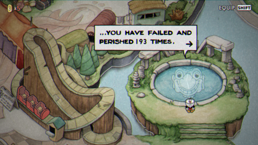
My favourite feature of all times, however, is this well you can visit to know the number of times you died so far.
The vision of the developer
Thinking more about all this, and considering my biased appreciation for thematic consistency in video games, I guess this is still not denying the fact that for some players, Cuphead might be frustratingly difficult, and not allowing for an enjoyable experience. Still, I can’t think about how most of the main pillars that make Cuphead what it is would stand with an easier level design.
All the things I mentioned in this article show that the game knows that it’s difficult, but also, how that makes the player feel, and takes all that to shape a particular player experience. Yielding to external pressure and doing things like tweaking difficulty for new platforms like Twitch would make the developers loose control of the threads that are so carefully and consistently intertwined.
Although I never got to fully understand why they would add an easy mode to the game, I’m happy to see how, in general, the studio stuck to their original vision, because that’s what made Cuphead memorable not just visually, but as a game, even if it’s not a game for everyone.
Leave a Reply