
So I’m reading Don’t make me think, a common sense approach to web usability (written by Steve Krug). And I’m amazed when I see the writer takes examples from classical written news design to illustrate usability rules that are relevant on today’s digital world. I was surprised mostly because I studied many of them about six years ago, on my Journalism degree, when the discipline was still figuring out how to make a solid theoretical basis out of the app ecosystem.
Back then I didn’t have a smart phone yet, and stained my fingers on newspapers ink on a daily basis, because that’s what everyone else did, and it felt like the right thing to do. Nevertheless, it comes out as a pleasant surprise that much of the stuff we learned back then I’m able to apply on my content creation and game design work. (Of course, many others don’t apply anymore, but my selective memory already got rid of that.)
So this post is a kind of homage to the perpetuity of (some of the) Knowledge, and to those 7a.m. visits to the news-stand of my student years. And to bring some airs of modernity, each comes along with a couple of examples from games and apps.
1. Organize content hierarchically
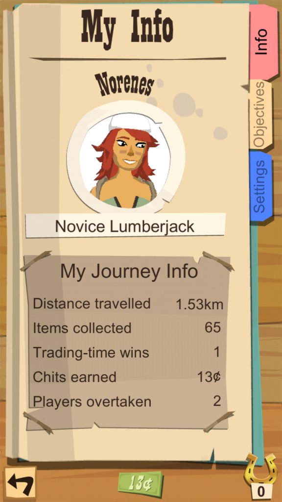
Like a very gentle and old-fashioned boatman who lends us a hand to embark on his boat, the design needs to smooth our way into the page. If there are several elements calling our attention with the same persistence, we’ll keep on scanning around in disgrace, not knowing where to lean the foot.
And if you think about it, that rule just fits how things work in reality. Not all the news in the world have the same importance, and not all the functions or actions of a specific screen are equally relevant at any given moment of the experience.
So create hierarchies and nest elements, build around a centre of visual impact, but do all that by continuously asking yourself what the reader (or user, or players) wants or needs to do.
2. Design for two depths of reading
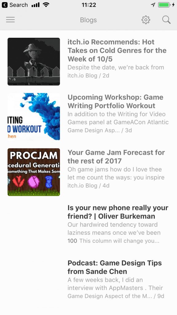
If I had to choose one of my learnings from those days as the cornerstone of news design, it would be this one. You’ll have people who has the time or energy to enjoy your content deeply and extensively. And then you’ll have other people who will get what they want just by scanning.
What do we do then? Several versions of the software? You could! But you can also parse two different paths the reader can follow into the same layout. Sounds tricky, but finding a balance there is beautifully challenging.
3. Balance the asymmetrical way!
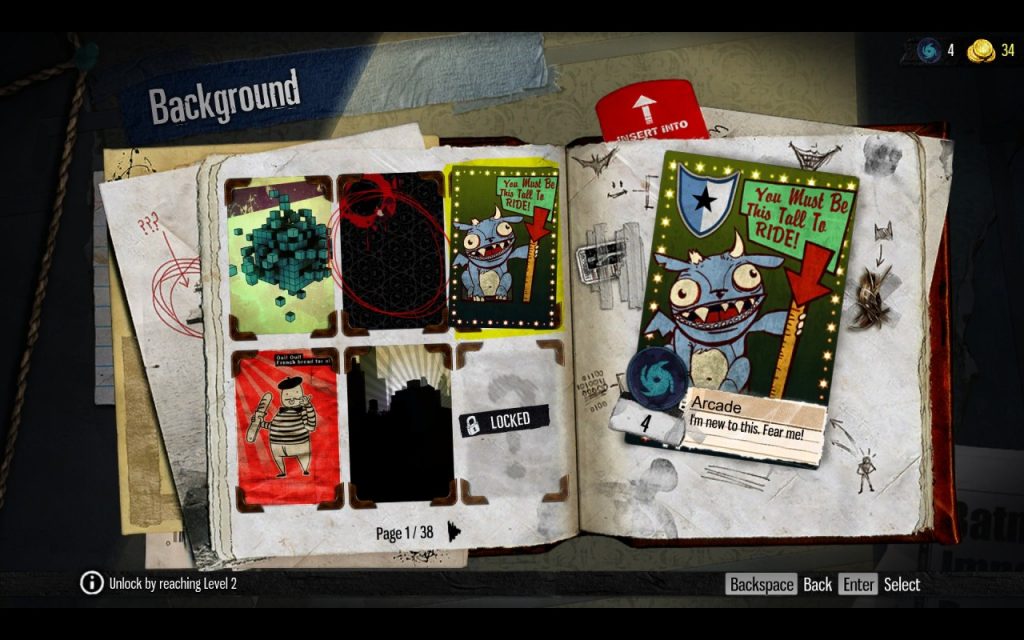
So, basically, in any web, newspaper, or app screen, you have many visual elements with varied weights depending on values like their color, positions, or proximity.
We take for granted that the human perception craves for a harmony in the arrangement of those, but even though symmetry might sound as the easiest way to achieve it, that kind of layout that comes at a cost.
Asymmetry prevents monotony and helps pondering the value of things. So take into account contrasts in aspects like size, shape, texture and direction.
4. Aim for unity and coherence, but use your brains!
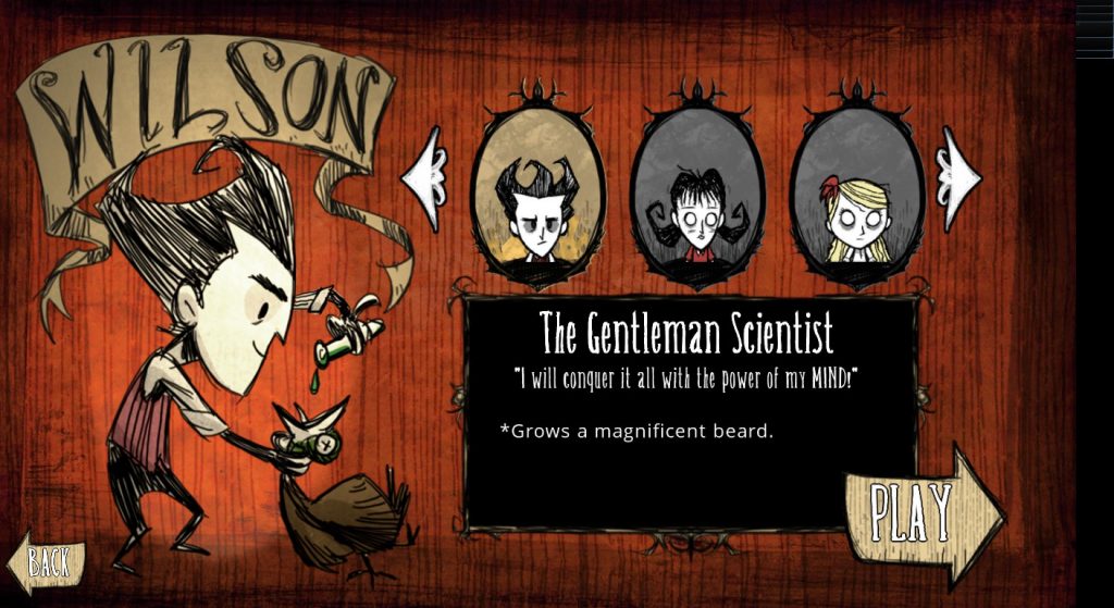
I find myself spotting incoherences in content, and demonizing them as if they meant the capital death! But I think I’m becoming more tolerant in that sense, and realizing that plotholes or inconsistencies on designs might be allowed to break rules if that helps clarity, which is the purpose for which they are actually established.
In any way, it might happen as well that what you think is breaking the overall rule set is actually developing a subset of those, with their slightly different own properties.
5. Remove the noise!
This is pretty self-explanatory, and might be applied to many kinds of things. Keep the goals of the design into mind, and then, remove everything that’s not building or reinforcing that.

Now break the rules!
So now I think we’ve come across five nice basic rules related to usability and human perception that can be applied to mostly any media, and also, of course, be broken at leisure once mastered. Enjoy your designing!
Leave a Reply