I’ve been playing Virginia, the 2016 game by Variable State.
It’s a fantastic game, very interesting from a narrative point of view. I’m sure it took them a great creative effort to figure out its visual language, which tells a complex story without any text at all.
And the result is very good, because the game manages to lead you thought the whole storyline dodging the risk of loosing your attention and focus on goals.
Telling a story without words
There’s, for example, a very clever use of ellipsis that gets rid of all that’s irrelevant, so that we don’t get distracted by elements that won’t add up to the story.
The design of the environment, also, with lighting, color and space, pushes us ahead organically, which feels very good.
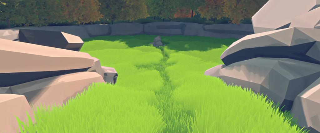
Symbolism is present throughout all the story as well, which kind of brings the language to a different level by adding a new layer of meaning to what happens.

Finally, the cursor, which changes its shape as a radar, is there to guide you towards your goal.



All these are nice resources, and I took many notes while playing, as I like elegant and minimalist design where nothing is superfluous.
The design challenge of point and click
It is tricky to design interesting puzzles on a point and click adventure, especially if there’s a critic path the player needs to follow, because if the player can’t find the solution, and if it’s a fairly wide world, they’ll end up lost, and most probably, quitting.
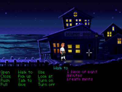
So that’s why after the point and click bursting that took place back in the days, game designers ended up realizing today’s audiences might be a bit more reluctant to waste too much time wandering around and trying to solve one single puzzle.
And that’s good, I think. I’m a fan of things like UX design myself, where we start from the assumption that the player/user will enjoy the experience more if it’s seamless and self-contained.
However, my theory is that too much simplification is not that good either, and I’ve seen those UX principles turning into a designers’ exacerbated fear to lose the player’s attention.
Virginia and its hyper focused interactive design
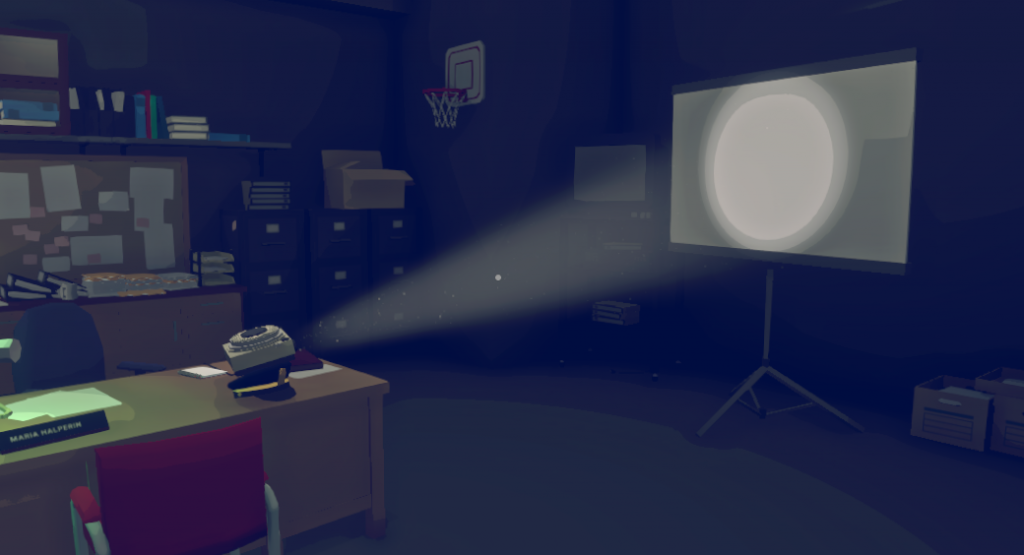
After a while playing Virginia, my initial feelings changed a little bit. The story and visual language were appealing from start to end, and that’s why I kept on playing, but if I started judging it as a video game, the fact that there was only one target at any given time, and that it was always pointed at me on an obvious way, reduced my role to that of a spectator.
Interactions in this game, then, end up being a formality to trigger the story beats.
It’s truth, though, that Virginia is a special work, and it shouldn’t probably be judged as a video game, but as what it is: a unique piece of interactive fiction. Still, as a player, I should also judge it according to my experience and to the way it makes me feel.
In that sense, taking part on the progress of the story became for me an automated process of trial and error, where finding the solution by just hovering the cursor over all the elements of the environment was always the easiest solution. You basically lose all the incentives to explore, because you know you can’t go wrong.
Ironically, trial and error is exactly what we resort to when we don’t know what we need to do in point and click games and we get stuck.
Games you can learn from
I still encourage everyone to try out this game. It has an amazing story, and the creative team behind it took risks and explored, something rather unusual on games with this high production value.
So if you’re a designers and want to get some narrative design inspiration, go take a look. See you next time!
Leave a Reply